Traacker.
Making court-mandated meeting attendance something a court can actually verify.
- My role
- Product designer: research, strategy and UX/UI
- Team
- Me, a PM and an engineer, working directly with the client
- Platforms
- iOS app and two web dashboards
- Status
- Designs approved and handed off; client planned a pilot at a Northern California courthouse
The problem
Proof of attendance was a signature on a slip of paper.
People who are ordered by a court to attend AA meetings prove it with a paper sign-in sheet. Those sheets are easy to forge, so courts and legal teams have no reliable way to know whether someone actually attended, and some people don't.
Traacker replaces the paper slip with a digital record: the person checks in and out of real meetings on their phone, and their legal team can follow their attendance and progress.
Research
My primary research was in-depth interviews with the client, who is an AA member himself and helps others in their recovery. He walked me through what meetings are like from the inside, how court-mandated attendees experience them, and where the paper process breaks down.
That gave me two sides to design for: the person in recovery, who needs this to be simple and respectful in a vulnerable setting, and the legal side, which needs a record it can trust.
One record, three users
Strategy sessions with the client turned "an attendance app" into a system with three users, each seeing the same attendance data in the form they need.
The attendee
iOS app
Finds meetings, checks in and out, tracks goals, and exports attendance for court.
The legal authority
Web dashboard
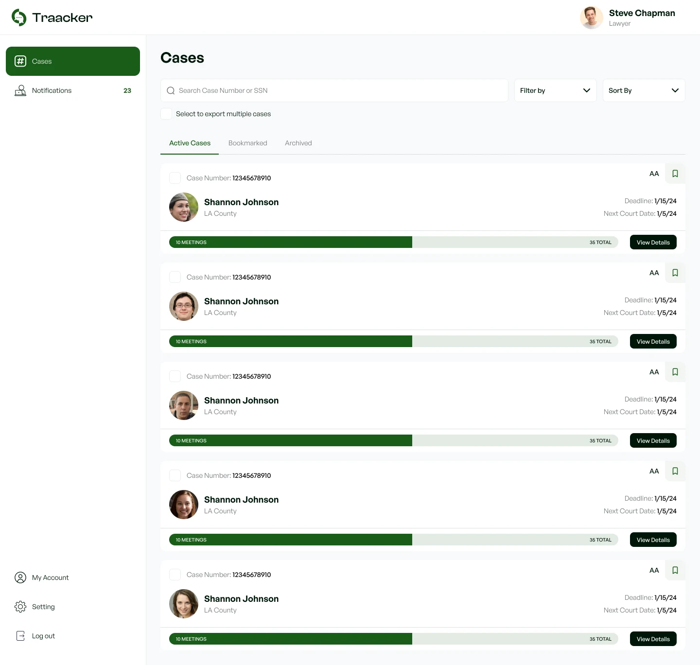
Follows active cases, sees each check-in and check-out, and downloads reports.
The admin
Web dashboard
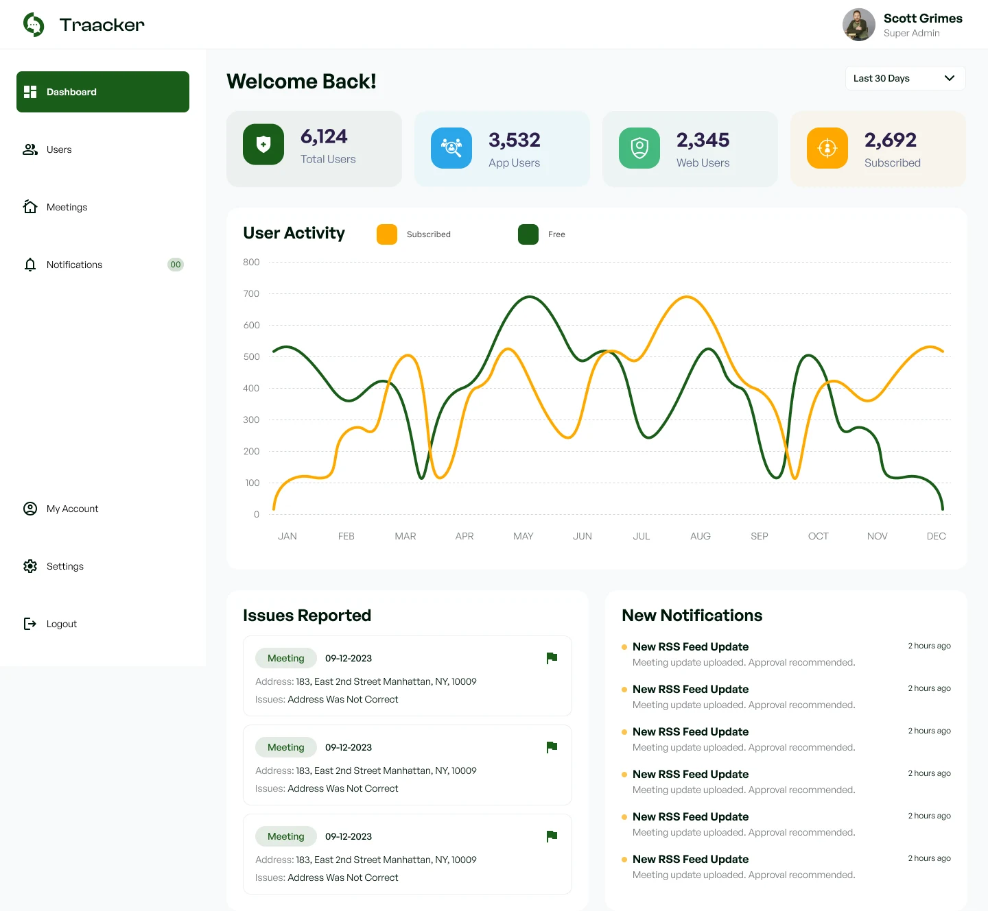
Manages users and meeting data, and resolves issues reported in the app.
From mood boards to wireframes
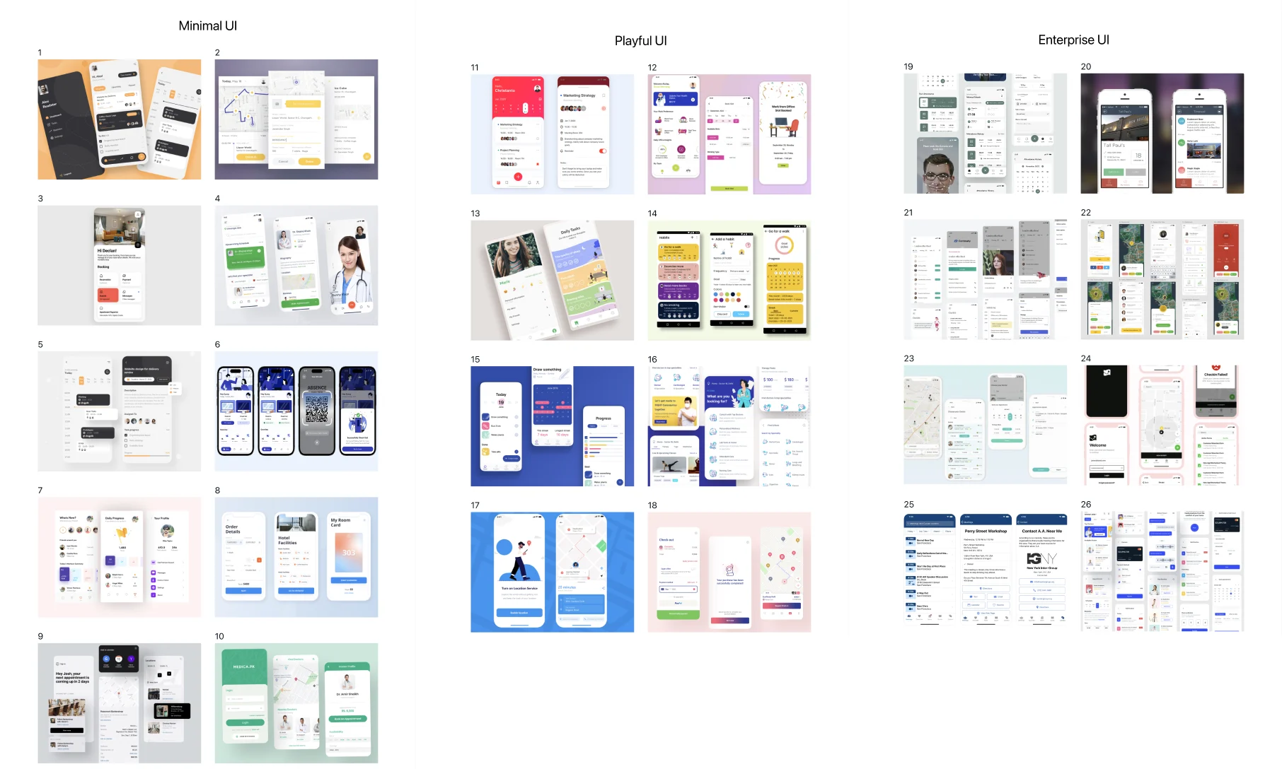
Before designing, I ran two rounds of mood boards. The first explored 26 references across three directions: minimal, playful and enterprise UI.
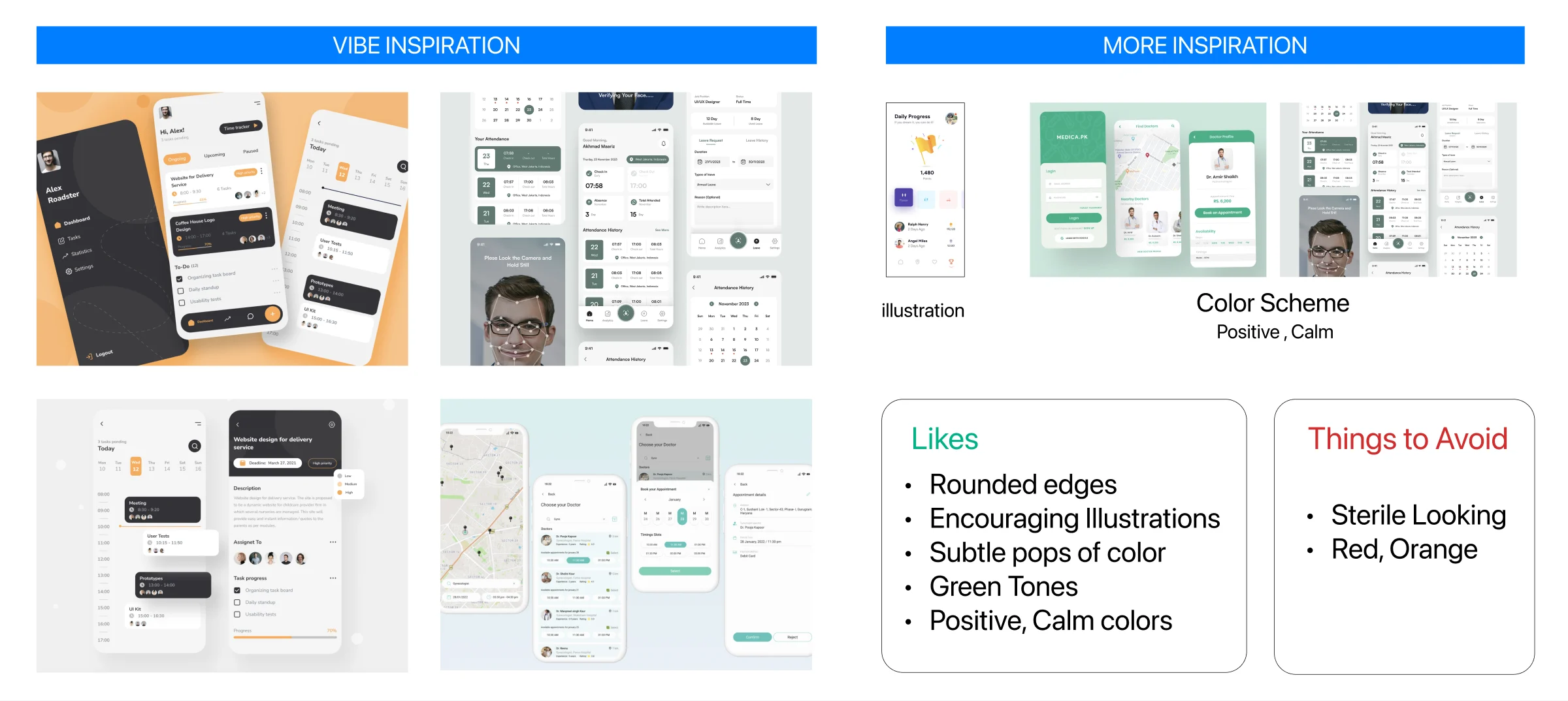
The second narrowed it to one direction and set the rules. Likes: rounded edges, encouraging illustrations, subtle pops of colour, green tones, and positive, calm colours. Things to avoid: anything sterile-looking, and reds and oranges. That green, calm direction carried through to the final UI.
Then I wireframed the whole product: about 140 screens across the iOS app and both web dashboards, from onboarding and case-number checks to goals, meeting search, issue reporting, and the legal and admin views.
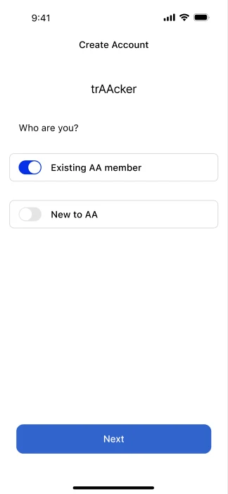
Existing member or new to AA
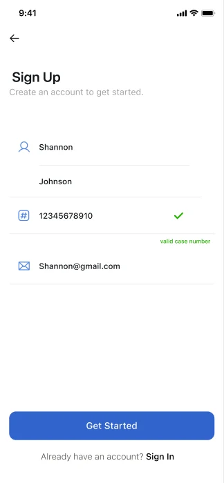
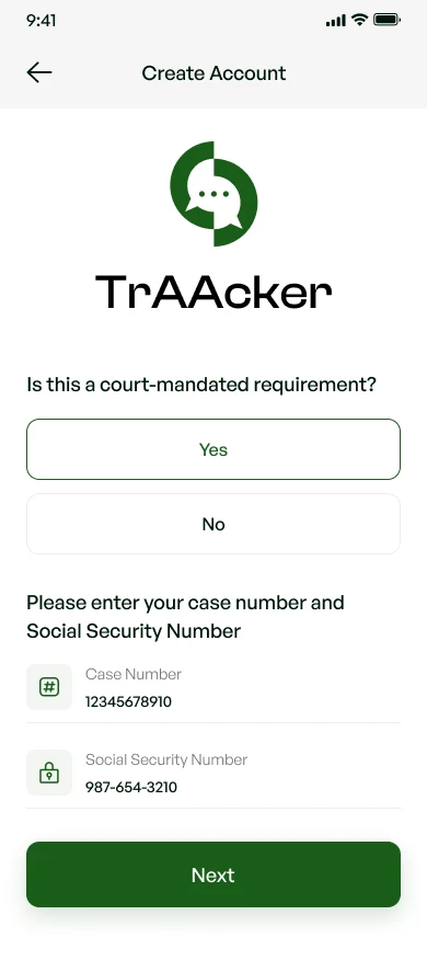
Case number checked at sign-up
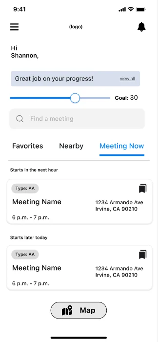
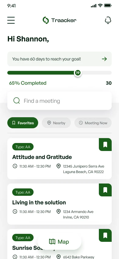
Home: goal, search, meetings
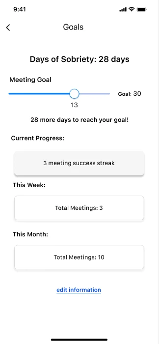
Goals and streaks
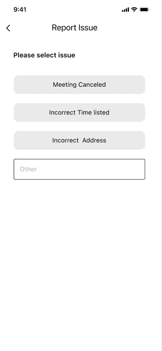
Report an issue
Key decision: geofencing
A digital button is just as easy to fake as a paper signature if you can press it from anywhere. The decision I'm proudest of is tying check-in and check-out to location: the app only counts attendance when the person is actually there, in the vicinity of the meeting.
I designed the flow to do that verification quietly. The app prompts check-in on arrival and reminds the person to check out when they leave, so a forgotten tap doesn't cost them a meeting they really attended.
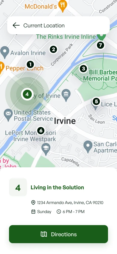
Find a meetingNearby meetings on a map, with directions to the one they choose.
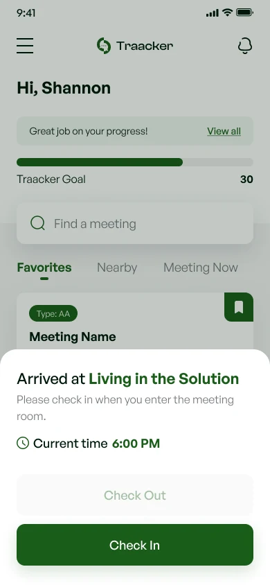
Check in on arrivalEntering the meeting's area triggers a check-in prompt with the current time.
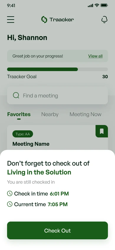
Reminder on leavingIf they leave without checking out, the app reminds them before the time is lost.
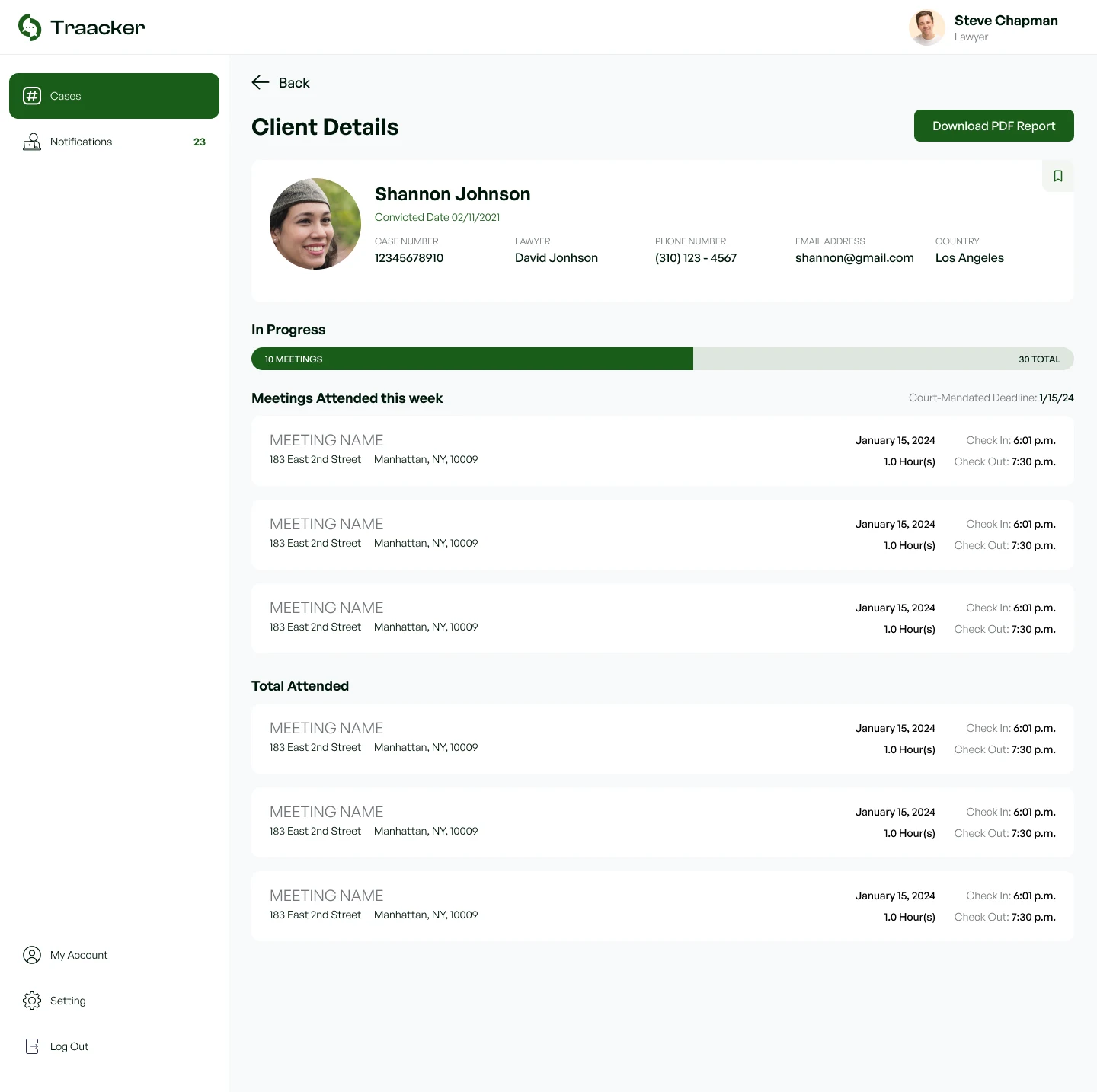
Verified on the legal sideThe same check-in and check-out times appear on the client's record.
Beyond compliance
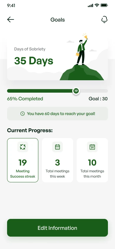
Court orders bring people to the app, but recovery is the real goal. The attendee experience frames attendance as progress rather than surveillance: a meeting goal with a progress bar on the home screen, a success streak, weekly and monthly totals, and days of sobriety.
Onboarding branches on one question, "Is this a court-mandated requirement?", so people attending voluntarily get the same tools without the legal setup.
The web side
Lawyers and court staff see a case list with each person's progress toward their required total, deadlines and next court date. They can bookmark or archive cases and export reports for several cases at once.
Admins get a dashboard of users and subscriptions, a queue of issues reported from the app (such as a wrong meeting address), and tools to manage meeting data and accounts.
A UI kit for the handoff
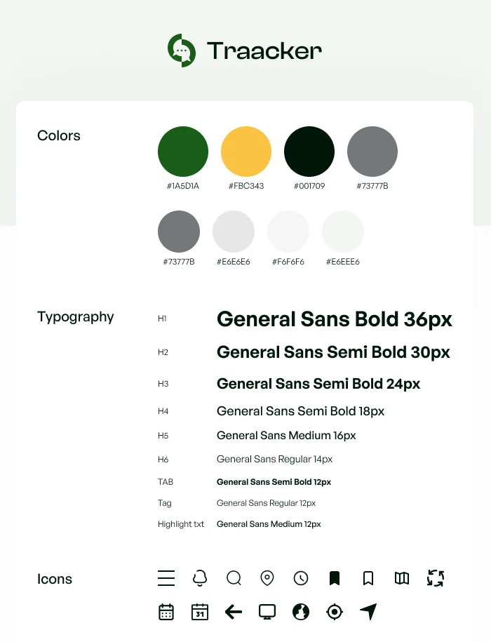
To hand off cleanly, I packaged the app into a UI kit: a green and yellow palette with supporting greys, a General Sans type scale from H1 down to tab, tag and highlight styles, and a matching icon set.
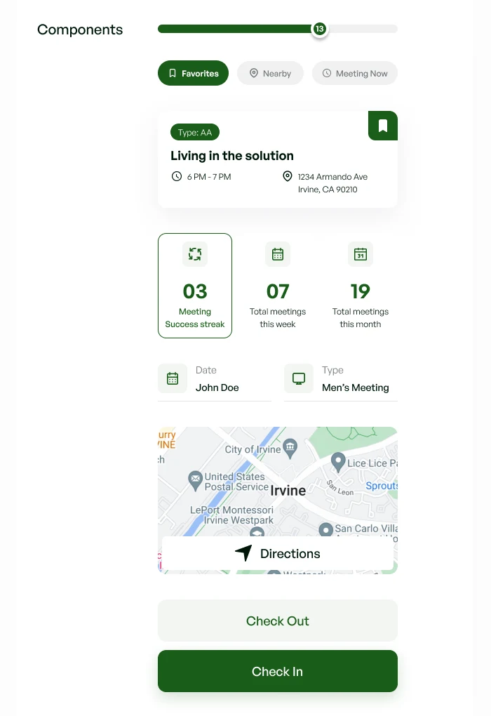
The components are the pieces the app is built from: the goal progress bar, the Favorites, Nearby and Meeting Now tabs, the meeting card, streak and total tiles, meeting detail rows, the map and directions card, and the check-in and check-out buttons. Engineers could build every screen from this one sheet.
Outcome
The client approved the designs for all three products, and I handed them off to the client and engineering team. They planned to launch first at their local courthouse in Northern California.
If I were measuring the launch, I'd start with these signals:
- Verified attendance rate: the share of check-ins that have a matching geofenced check-out.
- Missed check-outs recovered: how often the reminder turns a would-be lost meeting into a complete record.
- Legal adoption: how many cases legal teams actively follow, and how they rate it against paper slips.
What I took away
The interesting design problem wasn't the screens. It was trust: making a record strong enough for a court, in a setting where people are at their most vulnerable. Geofencing solved the first half; framing attendance as progress addressed the second.